[ 01 ]
FUSION ONE
Enabling a seamless, multi-platform Fusion experience across desktop, web, tablet, and mobile.

PROBLEM CONTEXT
Autodesk Fusion was powerful. Complex. And trapped on a desktop.
For years, this wasn't a problem—until our competitors launched mobile and web experiences while we watched potential customers slip away. Manufacturing engineers couldn't access their designs on the factory floor. Distributed teams struggled with workflow continuity. Product designers wanted tablet flexibility but had no option.
My role
Lead Visual Experience Designer
Tools

Figma
Year
2024-2025

TO TACKLE THAT, WE LAUNCHED
Fusion One Initiative
To strengthen Autodesk Fusion’s competitive market position and meet evolving customer expectations, the Fusion One initiative aims to deliver a seamless, high-performance experience across web, tablet, and mobile platforms.
120+
New Users
80%
Subscription
3X
New clicks
How might we...
Transform a desktop CAD application—built for mouse precision and keyboard shortcuts—into a unified experience that maintains its power while scaling across touch, stylus, and traditional inputs? Can you shorten this to the maximum.
[1] Rhino 3D

[2] Solidworks

[3] Onshape

Identified issues
Mixed Era UI patterns
Tool organization is not scalable
Inconsistent use of modality
Poor adaptation across device types
Overloaded toolbars and ribbon panels
Competitive Analysis
Observing Our Competitors
Identifying gaps in multi-device consistency and workflow continuity across leading CAD platforms


Our strategy
Launching just another Native app, NOT ENOUGH!
We wanted more. So we made a bold move:
Fusion, fully powered, right in your browser—accessible on any device, anytime.
"Because real innovation means breaking boundaries, not following them".
- Andrew Olcott, VP of UX Design | Autodesk
User reasearch
20 Users in a room
We ran a workshop with 20 users representing design, manufacturing, engineering, and electronics roles. For an hour, we explored how they used CAD tools across their workflows, diving into seven dimensions of software adoption.

Product Designer
"I want to sketch concepts on my iPad, then refine them on desktop."
Zhi Cao

Engineering Manager
"I just need to check measurements and approve changes while traveling."
Angella Curry

Manufacturing Eng
"I need to update CNC parameters while standing on the factory floor."
Taylor Quill
Conclusion
"Users weren't asking for different features on different devices. They were asking for the same capabilities with varying levels of complexity".
Mapping key workflows
Strategic Multi-Device Rollout
As Autodesk Fusion expanded to the browser, we intentionally avoided a “feature-parity everywhere” approach. Instead, we studied core user groups, identified their highest-value workflows, and matched those workflows to the devices best suited to support them.

Product Designer
Tablet (Stylus first)
Primary goal: Explore and iterate on concepts
Key workflow: Freeform sketching → early form exploration → quick edits
Why tablet works ?
-
Direct manipulation with a stylus
-
Large touch surface areas
-
Enables ideation away from desk

Manufacturing Eng
Tablet (Onsite, contextual)
Primary goal: Make informed updates during production
Key workflow: Review models → adjust CNC parameters → validate constraints
Why tablet works ?
-
Portable for the factory floor
-
Supports complex data
-
Enables quick edits on the go

Engineering manager
Mobile (Review and approval)
Primary goal: Maintain oversight and unblock teams
Key workflow: Review measurements → approve changes → leave comments
Why mobile works ?
-
Optimized for low input interactions
-
Supports asynchronous approvals
-
Reduces friction within teams
Designing for key workflows 1/3
Sketch environment
Product Designer
"I want to sketch concepts on my iPad, then refine them on desktop."
Zhi Cao
Toolbar


Browser
Global header
Viewcube
Timeline
Desktop view
&
Identified components
The toolbar, along with other components, is Fusion's command center—central to nearly every workflow. Transforming it was critical.

First draft :
Visual noise
The initial draft aimed to achieve feature parity between desktop and mobile. However, this approach introduced excessive visual noise, making it harder for users to focus on essential tasks on smaller screens.
User feedback
“Right now the sketch area feels really cramped. All the tools are visible at once, which can be overwhelming. I barely have space to draw.”
Final Design
Sketching on the go
Tablet interface focused on progressive disclosure and
providing users with tools to go.

.png)
Gesture
Single tap, double tap, and swipe to pan.
Touch target area
24px icon within a 44px touch target.
Semantics
Semantic tokens for colour, text & icons.
Density
Utilized medium-density tokens.
Adaptive strategies
Desktop components were thoughtfully adapted for tablet by prioritizing key tasks, reducing visual density, and optimizing interactions for touch.
1. Toolbar
The toolbar is Fusion's command center—central to nearly every workflow. Transforming it was critical.


Desktop behaviour
A pinned top toolbar provides persistent, context-aware tabs for quick workspace navigation, revealing additional tool details on hover.
Adaptive strategy
On a tablet, the toolbar pins to the screen edges to maximize the SketchUp canvas, using larger, touch-friendly controls.
2. Viewcube
The ViewCube is an on-screen 3D navigation control that lets users quickly orient, rotate, and switch between standard views of a model.


Desktop behaviour
On desktop, the ViewCube stays pinned at the top right, offering quick orientation controls with precise, hover-based interactions.
Adaptive strategy
On the tablet, the ViewCube is redesigned with clear touch targets and can be repositioned, enabling precise, flexible navigation.
3. Browser
The Browser is a persistent side panel that organizes the model’s hierarchy, enabling clear visibility, selection, and control of design elements.


Desktop behaviour
The Browser is a left-pinned, expandable panel that organizes the model hierarchy for quick navigation and control.
Adaptive strategy
On a tablet, the Browser moves under a More menu to keep the canvas clean while staying accessible on demand.
Sketch mode
Sketch Mode minimizes non-relevant UI elements, prioritizing canvas space and focus for uninterrupted sketching.


Designing for key workflows 2/3
Approve designs &
provide feedback

Engineering Manager
"I just need to check measurements and approve changes while travelling."
Angella Curry
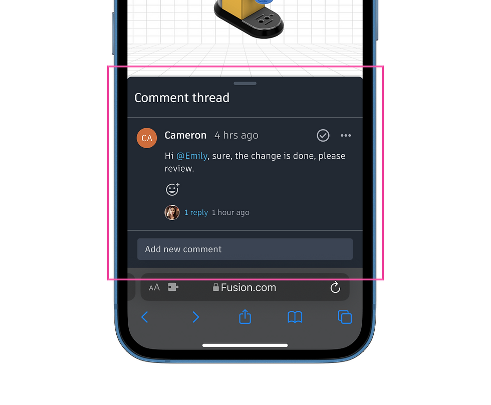
Comment panel

Desktop view
&
Identified components
The comment panel was identified as the primary component
as it provides space for feedback and approvals.


Adaptive design
Comment panel = Bottom sheet
The bottom sheet was selected as the optimal mobile pattern, balancing flexibility while preserving existing workflows.
Gesture
Single tap invokes bottom sheet
Touch target area
16px icon within 44px touch target
Semantics
Semantic tokens for colour, text & icons.
Density
Utilized low-density tokens.
Adaptive strategies
Desktop components were thoughtfully adapted for mobile by prioritizing key tasks, reducing visual density, and optimizing interactions for touch.
Comment panel = Bottom sheet
Instead of a persistent side panel, the threaded comments move into a bottom sheet that opens on demand to preserve canvas space.

Desktop behaviour
On the desktop, the comments are displayed in the side panel, which is pinned to the right hand side of the screen
Adaptive strategy
On the mobile interface, the comments are placed in a bottom sheet, which slides up without interrupting the current workflow.
Comment pin = Contextual tap targets
On mobile, pins stay on-canvas but become larger, touch-friendly indicators to support precise tapping without hover.


Desktop behaviour
On the desktop, the comment pin indicates the exact location, and upon click, it expands the details of the comments
Adaptive strategy
On mobile, to reduce clutter and provide clarity, the tap targets are larger, and the exact comment is shown without the thread.

Tablet interface
Floating panel
On a tablet, the panel opens on the right and remains draggable, allowing users to adjust it and maximize canvas space.
Designing for key workflows 3 /3
Updating CNC
parameteres

Manufacturing Eng.
"I need to update CNC parameters while standing on the factory floor."
Angella Curry
Setup modal

Desktop view
&
Identified components
The toolbar is Fusion's command center—central to nearly every workflow. Transforming it was critical.
Final design
Overseeing Critical CNC
Operations in Real Time
Updating and reviewing CNC parameters on the factory floor enables speedy and timely production, while avoiding loss.

Gesture
Single tap on task card
invokes breadcrumb
Touch target area
24px icon within 44px touch target
Semantics
Semantic tokens for colour, text & icons.
Density
Utilized medium density tokens
Adaptive strategies
Desktop components were thoughtfully adapted for mobile by prioritizing key tasks, reducing visual density, and optimizing interactions for touch.
Split modal = Breadcrumb
The details of the equipment are one of the crucial artifacts in this workflow, which is made easier to view with the breadcrumb UI


Desktop behaviour
On the desktop a dialog appears showing all critical information regarding the equipment, it is segmented
Adaptive strategy
On the tablet, the user is provided with a breadcrumb UI to dig deeper into the details one at a time avoid overwhelming with data.

Breadcrumb
Breadcrumb UI allowed users to dig deeper into the details of the task one at a time to avoid overwhelming users with data.
Setup sheet
This sheet displays crucial information, which is essential for production to be completed on time. It is one of the critical tasks for parameter engineers.

Dev handoff
Identifying gaps in multi-device consistency and workflow continuity across leading CAD platforms


Next project...
Fiix Software
Helps maintenance managers to optimizeresource allocation and quickly identify bottlenecks.
[ Year ]
2024


