Weave Design System
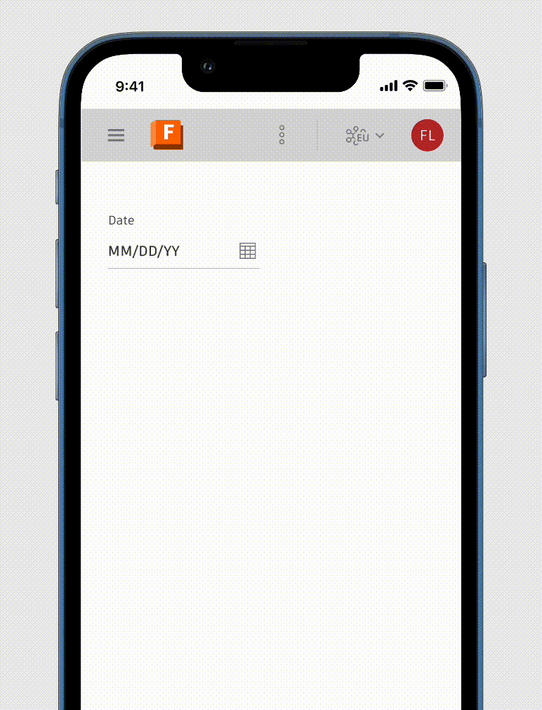
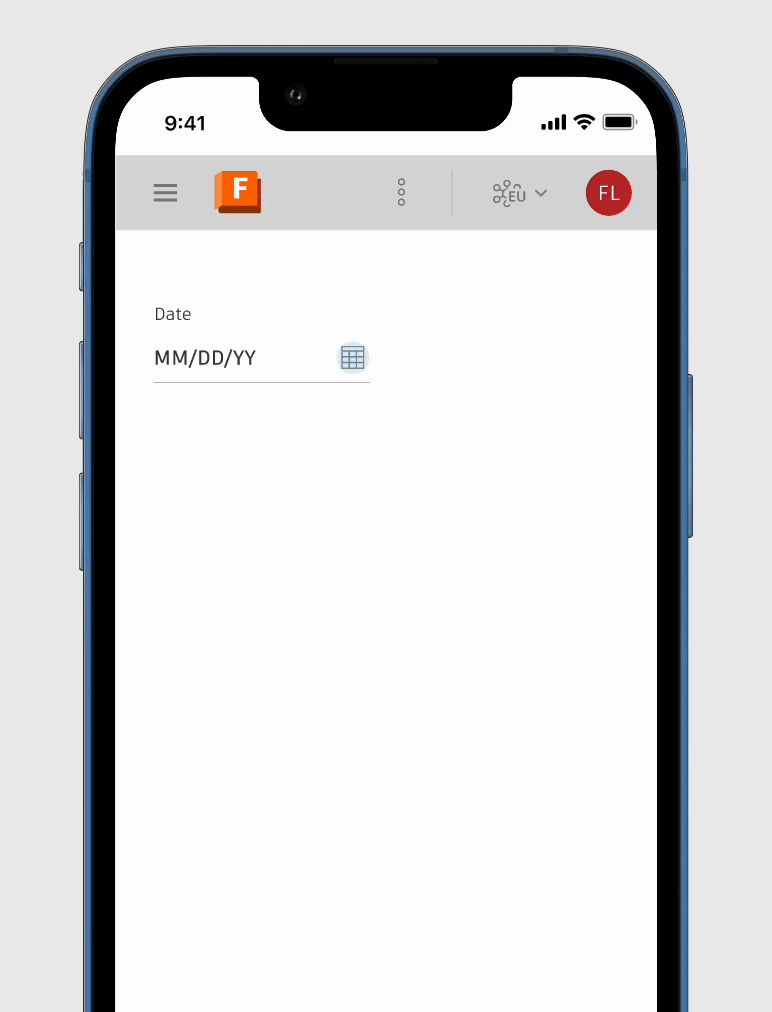
Adaptive Date Picker
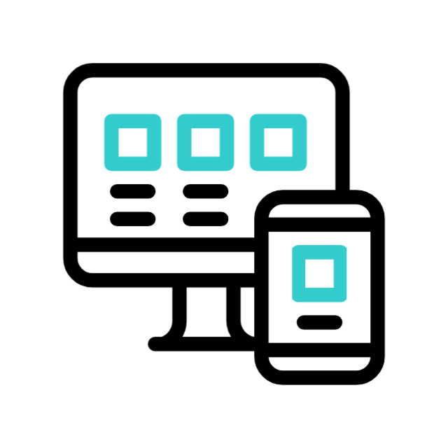
Designing low-density variants and mobile-first behaviour for the Weave Design System
Problem context
The existing Weave Date Picker was desktop-centric and did not scale well to mobile and tablet.
We needed to define low-density variants and touch-optimized behaviour to ensure a consistent, usable experience across smaller screens.

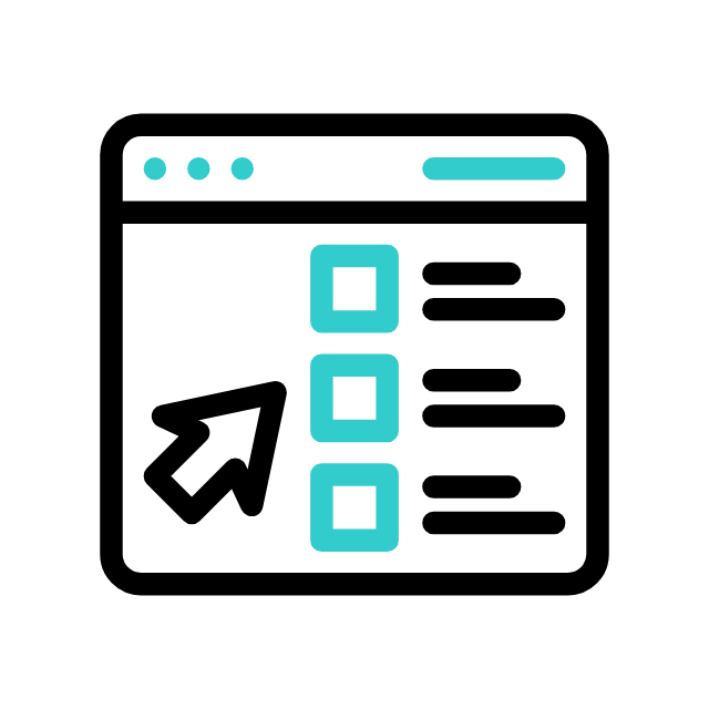
Key Contributions to Weave:
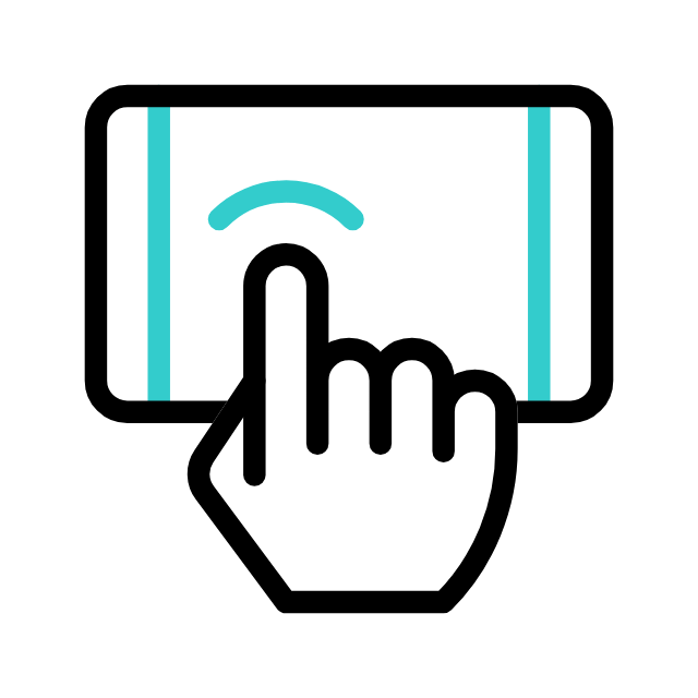
A low-density Date Picker optimized for touch-first and small screens
Defining Adaptive behaviour across mobile, tablet, and desktop
Clear guidance on touch behaviour(including gesture, bottom sheet container) & design specs for smooth dev handoff
Documentation enabling consistent adoption across product teams

Critical component
Powering Time-
Sensitive Tasks
Sets due dates that drive approvals and delivery timelines
Defines start and end dates for tasks, reviews & schedules
Directly impacts on-time execution across workflows
Business Impact
Date pickers power deadlines, approvals, and scheduling across Autodesk. Optimizing this component for mobile enabled faster, more reliable time-based decisions at scale.
Task at hand
Scaling Visual Systems
Across Platforms
Lead visual system strategy by designing scalable components, defining interaction patterns, and ensuring consistent, high-quality experiences across devices.
Define scalable behaviour and visual patterns for:
A low-density Date Picker that works seamlessly across mobile, tablet, and web within the Weave Design System.
Design interaction rules for touch-first use, including:
-
Scrolling
-
Selection states
-
Accessibility
-
Edge cases on smaller screens.
Document clear usage guidelines for consistency
-
Dos/don’ts
-
Variants
-
Responsiveness

Basic - Standard

Basic - month / year view

Range
Research
Internal & external audit
Analyzed competitor patterns and product gaps while aligning with existing component standards.
[1] Google flights

[2] Booking.com

[3] Airbnb

Design evolution
From First Draft to
Final System Component
Identifying gaps in multi-device consistency and workflow continuity across leading CAD platforms
1. First Draft — Establishing the Baseline
Goal:
Make the existing Date Picker usable on small screens.
Design process:
I started by adapting the existing medium-density Date Picker into a lower-density layout.
This first draft focused on:
-
Increasing spacing between dates
-
Enlarging tap targets
-
Simplifying visual hierarchy


Key learning
Reducing density alone wasn’t enough — the container and behaviour needed rethinking.
2. Exploration —
Rethinking Container & Interaction
Key Question: What is the most natural container for touch-first
date selection?
I explored two primary directions:
Popover-based Date Picker:
-
Familiar and aligned with desktop behaviour
-
Worked well on tablets in landscape
-
Still fragile on small screens
Bottom Sheet Date Picker:
-
Naturally thumb-reachable
-
Allowed generous spacing without crowding
-
Provided clear entry and exit states
Design decision & Stakeholder feedback
The bottom sheet quickly proved more resilient for mobile and compact environments, while popovers remained useful for larger screens. The low-density variant needed adaptive containers, not a single fixed pattern.


3. Refinement — Designing for Touch, Not Just Scale
Focus:
Make touch interactions feel intentional, not accidental.
Key refinements included:
-
Clear separation between month navigation, date grid, and actions
-
Scroll-based month navigation instead of tight pagination controls
-
Large, forgiving tap targets with strong selection states
-
Predictable dismissal patterns (explicit actions over accidental closes)
Result:
The component felt calmer, more confident, and easier to use — especially one-handed.
4. System Alignment — Bringing It Back to Weave
Density & Layout
Touch-Optimized, Not Simplified
Design Decisions
-
Increased hit targets and spacing for finger precision
-
Clear visual separation between month navigation, calendar grid, and actions
-
Reduced decorative elements to prioritize legibility
UI Wins
-
Faster date selection with fewer mis-taps
-
Calendar remains scannable at a glance
-
Touch comfort without sacrificing information density
Interaction & Behavior
Built for Fingers, Familiar to Mouse
Design Decisions
-
Tap-first interactions with immediate visual feedback
-
Vertical scroll for months instead of pagination on touch
-
Clear, intentional open/close states with safe dismissal
UI Wins
-
Natural mobile behaviour (scrolling months feels intuitive)
-
No accidental loss of input
-
Same mental model across devices, different interaction mechanics
Visual Consistency & System Parity
Built for Fingers, Familiar to Mouse
Design Decisions
-
Typography, colour, and states reused from Weave tokens
-
Icons and affordances aligned with existing patterns
-
Same component anatomy across densities
UI Wins
-
Feels unmistakably “Autodesk” across products
-
Teams don’t need to relearn patterns per platform
-
Visual trust is preserved while interaction evolves
Dev handoff
Identifying gaps in multi-device consistency and workflow continuity across leading CAD platforms


Component setup
Identifying gaps in multi-device consistency and workflow continuity across leading CAD platforms

Next project...
Autodesk Fusion
Fusion One
Device independence in Fusion is essential for the Unified Fusion Industry Cloud. It utilizes flexible Weave components to deliver a consistent experience across devices and browsers
Timeline
2024 - Present