[ 04 ]
FUSION ICONS
Designed pixel-precise Fusion icons that scale across densities and light/dark themes, aligned with Autodesk icon guidelines.


Project overview
Iconography for Autodesk Fusion (Electronics Module)
A scalable icon system designed for Autodesk Fusion, focused on toolbars, panels, and browser contexts across multiple densities and themes.
Designed over
New Icons
250+
Tools

Figma
.png)
Illustrator
Year
2024- Present
Scope
Constraints &
system requirements
Lead visual system strategy by designing scalable components, defining interaction patterns, and ensuring consistent, high-quality experiences across devices.

Considering the varying densities and devices, we focused on three sizes.

The three mentioned densities make sure the icons are scalable.

Utilizing semantic tokens for a quick theme swap to ensure consistency.
Task at hand
Defining a Scalable Icon
System for Fusion
Designed and standardized icons for Fusion’s Electronics module across core UI surfaces, supporting multiple densities and light/dark themes.


Impact
Fusion’s complexity demands icons that communicate instantly—making pixel-perfect, system-aligned design critical to usability, efficiency, and scale.
Design evolution
From concept to system
This work elevated icons from isolated assets into a scalable system, grounded in clear semantics, grid precision, and consistent behavior across densities and themes.
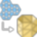
Concept & Semantics
-
Interpreted complex electronics concepts into simple, recognizable metaphors
-
Avoided ambiguity between similar functions
-
Prioritized meaning before aesthetics
.png)


Pixel Precision & Scaling
-
Designed on a strict grid to ensure sharp rendering
-
Adjusted stroke weight and detail per size
-
Ensured visual balance across all densities


In-app application
Toolbar
The toolbar is the centralized UI identified which encompasses most icons.
Sketch environment —
Designing for the toolbar
Form
In a sketch environment, form refers to maneuvering existing shapes and designs to desired results.

Create form
Enters form mode and inserts a form feature into timeline

Extrude
Adds depth to open or closed sketch profiles or faces

Merge edge
Aligns the first set of selected edges to second selected edges

Display mode
Sets the body display to smooth, box or control frame.

Solid
In a sketch environment, solid refers to creating and editing shapes and forms to desired results.

Sweep
Joins, cuts or intersects two or more solid bodies to create one

Edit loft
Let's you edit the transitional shape between two or more sketch


Shell
Create a hollow cavity with walls with specified thickness.


Tessellate
Converts an existing solid or surface body into a mesh body.
In-app application — Toolbar, panels and browsers.

Tablet interface
This interface utilizes medium-density icons of 24px with a touch target of 44px.
Mobile interface
This interface utilizes low-density icons of 16px with a touch target of 44px

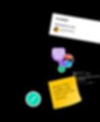
Collaboration &
Dev handoff
Dev input was extremely crucial in the handoff process as
We wanted to align the naming conventions with the dev repository.

File naming conventions
The naming conventions were aligned with the dev repository for 100% alignment.

Folder structures
The folder structure gave clarity on which domain, workspace & component it belongs to.

Export formats
This made sure to have SVG and PNG in different sizes for density specifics.
Next project...
Weave Universal & Extended - Design system
Designed pixel-precise Fusion illustration that scales across densities and light/dark themes, aligned with Autodesk guidelines.
[ Year ]
2025 - Present